
So this is my final magazine front cover.
I decided to use sans-serif font because it'll attract more attention and it is a-lot easier to read sans-serif font on paper rather than online.
I used the main subjects my audience wanted so that it can attract them more to read the news paper.
The colour scheme is really simple and I decided to go for a sophisticated but simple black and white colour scheme to attract more people.
Everything is boxed and in order because I don't think that magazine with clutter look smart at all.
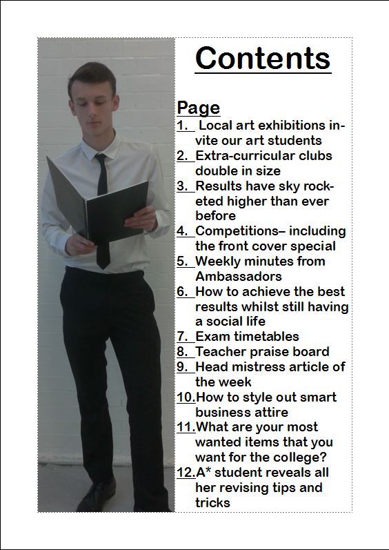
This is my contents page, it is really simple but effective in my opinion because it is really easy to navigate to certain pages in the magazine.
I continued with the simple colour scheme and that way I would not confuse my readers. I think that this contents page is rather effective considering the only software I used was Microsoft Publisher .
No comments:
Post a Comment